
In this fast-paced world where smartphones and tablets are our constant companions, having a responsive web design has become an essential part of the digital space. Responsive web design isn’t just a buzzword; it’s a game-changer that can make or break your online presence.
So, let’s get straight into the world of responsive design and understand why it’s a must-have in today’s mobile era.
Understanding Responsive Web Design
Responsive web design is like having a chameleon-like website that effortlessly adapts to the device it’s being viewed on. Whether your audience is browsing your site from a massive desktop monitor or a tiny smartphone screen, a responsive website seamlessly adjusts its layout, content, and features to provide the best possible user experience. It’s like tailoring your website to fit every user’s device perfectly.
Why Responsive Web Design Matters in the Mobile Age

The dominance of mobile devices is undeniable. People are using their smartphones for everything—connecting, shopping, exploring, and more.
Here’s why responsive web design is the superhero your website needs in this mobile-driven world:
1. Seamless User Experience
In an era of instant gratification, users demand fast-loading websites that offer a smooth experience across devices. A responsive design ensures that your website looks and works flawlessly on any gadget. By keeping users engaged and happy, you increase the chances of them staying on your site longer.
2. Mobile-First Indexing
Search engines are now favoring mobile-first indexing. This means that the mobile version of your website is a significant factor in determining your search engine rankings. A responsive design ensures that your site not only impresses users but also meets the criteria search engines are looking for.
3. Wider Audience Reach
A responsive website extends its arms to a broader audience. Whether your target users are Android enthusiasts or iPhone aficionados, a responsive design guarantees that your content is accessible to all. This versatility boosts your reach and enhances user experience.
4. Enhanced Conversions
User experience and design are key players in conversion rates. A website that’s clunky on mobile devices frustrates users and leads to abandoned shopping carts. On the flip side, a responsive design creates a user-friendly journey, making it easier for visitors to browse, shop, and convert. The result? Higher conversion rates and increased sales.
5. Cost-Effective Solution
Instead of creating separate websites for each device, responsive design offers an economical approach. With one design that fits all, you save time and resources. Moreover, responsive sites adapt to future devices, reducing the need for frequent redesigns.
6. Building Brand Credibility
Your website’s appearance speaks volumes about your brand. A responsive design showcases your commitment to a seamless user experience, boosting your brand’s credibility. Users trust and engage with professional-looking sites, increasing their likelihood of converting.
The Technical Marvel of Responsive Web Design
Responsive web design is like a symphony of technology, combining various elements to create a harmonious user experience across devices.
Here’s the backstage tour:
1. Fluid Grids and Layouts
At the core of responsive design are flexible grids that adapt to different screen sizes. These grids ensure that your content, images, and layout remain consistent, no matter the device. It’s like having a virtual elastic that stretches and contracts, always ensuring a visually pleasing display.
2. Fluid Images
Images can make or break a website’s appearance. In responsive design, images scale proportionally, ensuring they fit snugly within their containers. This prevents images from being too small on larger screens or overwhelming on smaller ones.
3. Media Queries
Media queries are your website’s way of asking, “Hey, what’s the screen size?” These queries allow your site to apply specific styles based on the user’s device. It’s like tailoring your website’s outfit to match the occasion.
4. Flexible Typography
Text matters and responsive design ensures your typography adapts seamlessly. Font sizes adjust to different screens, making your content legible without requiring users to zoom in or squint.
Benefits of Responsive Design
Responsive design isn’t just about aesthetics; it’s a superhero that brings a range of benefits to the table:
1. Future-Proofing
Responsive websites are like chameleons that can adapt to future devices. You won’t need to redesign your site each time a new gadget hits the market. Your website will be ready to impress, no matter the screen size.
2. Enhanced User Experience
Remember the frustration of zooming in and out on a non-responsive site? Responsive design eradicates this annoyance, providing a smooth experience that keeps users engaged and happy.
3. Boost in SEO Performance
Search engines love responsive design. By having a single, consistent version of your site, search engines can efficiently crawl and index your content. Plus, lower bounce rates and higher engagement positively impact your search rankings.
4. Cost-Effective Maintenance
Maintaining multiple versions of a website can be a headache. Responsive design simplifies things by requiring updates and maintenance for a single site. It’s a win-win for your time and resources.
Real-World Examples: Responsive Design in Action
Now, let’s see responsive design in action with a couple of real-world examples:
1. Starbucks
Whether you’re ordering a pumpkin spice latte on your laptop or checking out their menu on your phone, Starbucks’ website adapts flawlessly. The layout, images, and content seamlessly adjust, providing an inviting experience.

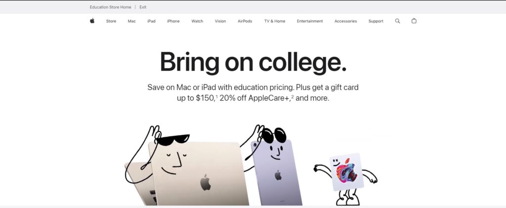
2. Apple
Apple is a master of responsive design. Their website looks stunning and functions smoothly on various devices. Whether you’re exploring the latest iPhone on a tablet or a desktop, the experience is consistently exceptional.
3. Amazon
The e-commerce giant, Amazon, knows the importance of responsive design. Their website ensures that browsing, shopping, and checkout are hassle-free, regardless of the screen size.

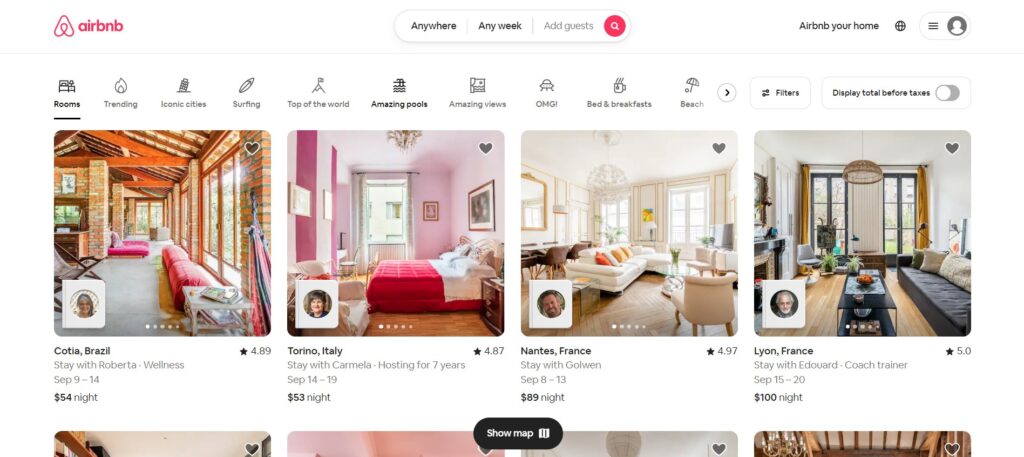
4. Airbnb
Searching for your dream vacation rental? Airbnb’s responsive website makes sure you can explore listings and make bookings seamlessly from any device.
Unlock the Potential of Responsive Design
As we conclude, remember that responsive design isn’t just about making your website look pretty. It’s about adapting to the changing digital landscape, meeting user expectations, and staying ahead of the curve.
At IK Technologies, we specialize in creating responsive websites that blend cutting-edge technology with stunning design. Let us be your partner in bringing the magic of responsive design to your online presence. Whether you’re a small business, a creative individual, or an enterprise, we’re here to help you unlock the potential of responsive design and provide a seamless user experience across devices. 🌐📱💼
Stay connected with us for more insights, tips, and tricks to thrive in the ever-evolving digital realm. Your journey to responsive excellence begins here! ✨🚀
FAQs about Responsive Web Design
What’s the heart of responsive design?
A: Responsive design involves flexible grids, fluid images, and media queries. These elements enable your website to adapt and provide an optimal experience, irrespective of screen size.
Can I revamp my existing site to be responsive?
Absolutely! While the process varies based on complexity, professional web developers can guide you through a smooth transition.
How does responsive design affect SEO?
Responsive design ensures consistent user experience, positively impacting SEO. It eliminates the need for separate mobile sites and contributes to lower bounce rates and higher engagement—factors search engines adore.
Is responsive design only for e-commerce?
Nope! Responsive design benefits all websites. Whether you run a blog, portfolio, or informational site, providing an exceptional user experience is crucial.
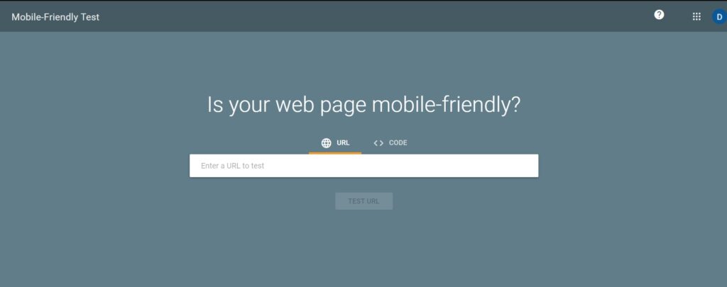
How can I test my site’s responsiveness?
Tools like Google’s Mobile-Friendly Test evaluate your site’s mobile-friendliness. Manual testing on different devices also ensures a consistent user experience.
Does responsive design affect website speed?
Absolutely! Responsive design optimizes images, files, and code, resulting in faster load times. This boosts user experience and positively impacts search engine rankings.